Monday, 26 July 2010
Sunday, 28 March 2010
How did you use new media technologies in the construction and research, planning and evaluation stages?
In my research I used the internet to find out different information about the companies and videos already out there. Web 2.0 had a real benefit for me when making my research PowerPoint as it meant that I could insert videos from www.youtube.com that other people have produced. This adds an interactive feature to my research as I can see the video and analyse it in the same PowerPoint.
The internet also provided me with instant information about the film companies which were going to fund me. I used the film company’s website – www.virginshort.com and www.film4.co.uk both of these website gave me information about the official history of the companies. it also gave me in depth who they help and what sort of contacts they can give to help people out. The information I found out was which percentage strength should I use to make the blur effect the most effective, the answer was 34%. This is so that the strength is enough to blur it but at the same time it is slightly faded so it fades into the background. This was very handy as it creates a professional feel to my work.
The internet also provided me with information on how to create my images in Photoshop. This was a real help as I wanted to blur my trees but I was not sure how to do it so I typed it into the internet and I found a online tutorial which taught my how to do it which really helped. www.photoshophelp.com This website was really handy in making sure I had all the skills to make sure my poster looked of highest quality.

When planning my production I used PowerPoint which I have been using for many years but the thing which I hadn’t learnt was how to add a youtube video to the PowerPoint. This took me a while to find out but I found a tutorial on www.youtube.com which told me step by step how to add a video to PowerPoint. With out this technology I would have to insert a link which then would take the user to an external website. This cuts down a lot of download time as when the PowerPoint is open the videos already start to buffer, this would be different if they were external links.
When producing my film operating a tape camcorder was a new skill I have learnt as when I did my year 12 coursework I used a digital camcorder. The different types of camcorder were very different as with the tape camcorder you always have to make sure you have your tape this is something I learnt very fast, as I would get the place where I would like to shot my film and the realised that I didn’t have the tape to film so I had to waste more valuable time to collect the tape. When filming the type camcorder would pick up less light this is why when I was filming I had to use more artificial light to make sure the high key light effect was being produced. When uploading footage onto Adobe Premiere I had to get the school ICT technician to help me out as I was used to use the fire wire for the digital camcorder but for the tape camcorder you had to use the red yellow and white cables. These are all necessary skills I have learned about the technology within the media industry.
When constructing my evaluation I used www.blogger.com, a site I had never heard of before this project. The website allowed me to save my work to a website which meant that I could take it home when my memory stick was full with all my other work. This website saved a lot of time and hassle as it meant that I knew exactly where all my work was at any one time. The blogger site allowed me to sample my work to my target audience with me sending them the link to view my poster instead of me sending them the individual file. My target audience were a lot happier with that fact that they didn’t have to deal with a lot of paper work as it meant that when they have a free 5 minutes they could pop onto a computer and send me the results of there feedback and it was all instant. It was a lot harder to lose work as it was all stored onto the Blogger site. After every lesson I would write a little comment and post it onto the website to make sure when I was doing my evaluation the Blogger site would be there to jog my memory and make sure I include all the information I need to. With regarding sending my work off to the examiner it means that I can include screen shots and parts of my video so the examiner can identity what parts of my project I am talking about.

The internet also provided me with instant information about the film companies which were going to fund me. I used the film company’s website – www.virginshort.com and www.film4.co.uk both of these website gave me information about the official history of the companies. it also gave me in depth who they help and what sort of contacts they can give to help people out. The information I found out was which percentage strength should I use to make the blur effect the most effective, the answer was 34%. This is so that the strength is enough to blur it but at the same time it is slightly faded so it fades into the background. This was very handy as it creates a professional feel to my work.
The internet also provided me with information on how to create my images in Photoshop. This was a real help as I wanted to blur my trees but I was not sure how to do it so I typed it into the internet and I found a online tutorial which taught my how to do it which really helped. www.photoshophelp.com This website was really handy in making sure I had all the skills to make sure my poster looked of highest quality.

When planning my production I used PowerPoint which I have been using for many years but the thing which I hadn’t learnt was how to add a youtube video to the PowerPoint. This took me a while to find out but I found a tutorial on www.youtube.com which told me step by step how to add a video to PowerPoint. With out this technology I would have to insert a link which then would take the user to an external website. This cuts down a lot of download time as when the PowerPoint is open the videos already start to buffer, this would be different if they were external links.
When producing my film operating a tape camcorder was a new skill I have learnt as when I did my year 12 coursework I used a digital camcorder. The different types of camcorder were very different as with the tape camcorder you always have to make sure you have your tape this is something I learnt very fast, as I would get the place where I would like to shot my film and the realised that I didn’t have the tape to film so I had to waste more valuable time to collect the tape. When filming the type camcorder would pick up less light this is why when I was filming I had to use more artificial light to make sure the high key light effect was being produced. When uploading footage onto Adobe Premiere I had to get the school ICT technician to help me out as I was used to use the fire wire for the digital camcorder but for the tape camcorder you had to use the red yellow and white cables. These are all necessary skills I have learned about the technology within the media industry.
When constructing my evaluation I used www.blogger.com, a site I had never heard of before this project. The website allowed me to save my work to a website which meant that I could take it home when my memory stick was full with all my other work. This website saved a lot of time and hassle as it meant that I knew exactly where all my work was at any one time. The blogger site allowed me to sample my work to my target audience with me sending them the link to view my poster instead of me sending them the individual file. My target audience were a lot happier with that fact that they didn’t have to deal with a lot of paper work as it meant that when they have a free 5 minutes they could pop onto a computer and send me the results of there feedback and it was all instant. It was a lot harder to lose work as it was all stored onto the Blogger site. After every lesson I would write a little comment and post it onto the website to make sure when I was doing my evaluation the Blogger site would be there to jog my memory and make sure I include all the information I need to. With regarding sending my work off to the examiner it means that I can include screen shots and parts of my video so the examiner can identity what parts of my project I am talking about.
What have you learned from your audience feedback?
My target audience changed over the time of me producing my film. At first I thought I would make it for class C & B people. These are people who are working within an industry but on a low to average salary. I also marketed my product at first at male and female target audience but after I changed my genre to romance my target audience changed more too female. As the male audience is less likely going to watch a romance film.
Throughout producing both the ancillary and main production I have been given feedback from my target audience to make sure I am on track so that it appeals to them and not me. As romance is not my favourite genre I found it hard to make sure that the poster has all the standard conventions. When conducting my feedback I made sure I asked a wide variety of people but as it is mainly aimed at girls I made sure that I had more girls in my test audience than boys. Most of my audience feedback was conducted with 5 girls and 3 boys. This is so I had a wide variety of feedback.
After I produced my film poster I held a audience feedback session which consisted of me handing out my poster to all the people who turned up. The comments were very varied, 6/7 really liked the idea of the posters going across the double page. When I got my feedback from my target audience about my poster they stated that the logos at the bottom don’t match up.
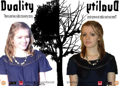
As you can see the logos are not in the same place on both sides of the paper. After I consulted my target audience I went back to the drawing board and made sure that I corrected all the changes they told me to do. This taught me that the audience are very detailed in what they like and what they don’t. When your target audience don’t like something they tell you which is good but I needed to be able to take constructive criticism and build my product around my target audience and not me.
I have also learned that my target audience of 16 – 35 year olds females can be very picky in what they like and if they like something one week their ideas can change within a few days. I found this out when I was audience testing my film magazine poster picture. I had a big picture across the top with it having my actor brushing her teeth in the mirror to represent mirror images. A handful of my target audience really thought the image was good when I asked them to view my work but when I got them together about my titles about two days later they decided that they didn’t like the picture any more so it meant that I had to reshot my photos due to the fact that my target audience didn’t think it was a good image that worked well with the title. Having good mise-en-scene when making a film means that the audience are able to identity with what is being shown. In any amateur film lighting is a key issue; lighting can make or break a film. With my stages of editing I made sure that every minute I would make sure that some of my target audience looked at it to make sure that the lighting was correct for the different scenes. As my target audience suggested that the film should be in different colour so that they can understand the mood of the different film.
 As you can see the colour is a lot darker in the right hand screen. I did this due to the feedback I received.
After getting feedback about the lighting in my film within the editing suite I added spotlights so that it lightens the screens, this was so that there was higher key lighting with in scene. When getting feedback from my target audience I always thought over what they said as I am not within my target audience so I could be doing something which they do not want and trying to pass it off as something which it is not. When making or constructing any piece of work I had to ask myself what my target audience would say. This helped me understand what I needed to do.
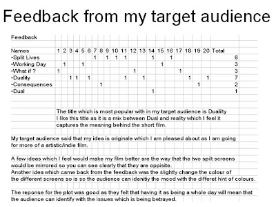
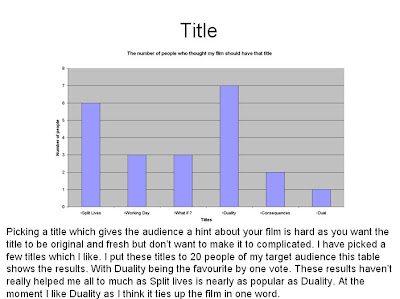
When making my film I had to make up a name of my brand, I found this very hard as my title had to be original yet get the narrative across. I had many different titles which I could have used. I couldn’t decide so I thought it would be best to ask my target audience what they thought. I handed my questionnaire with a little pitch to describe my narrative. When I gathered my feedback the results favoured Duality which was my preferable title so I picked this as my brand name.
Throughout producing both the ancillary and main production I have been given feedback from my target audience to make sure I am on track so that it appeals to them and not me. As romance is not my favourite genre I found it hard to make sure that the poster has all the standard conventions. When conducting my feedback I made sure I asked a wide variety of people but as it is mainly aimed at girls I made sure that I had more girls in my test audience than boys. Most of my audience feedback was conducted with 5 girls and 3 boys. This is so I had a wide variety of feedback.
After I produced my film poster I held a audience feedback session which consisted of me handing out my poster to all the people who turned up. The comments were very varied, 6/7 really liked the idea of the posters going across the double page. When I got my feedback from my target audience about my poster they stated that the logos at the bottom don’t match up.
As you can see the logos are not in the same place on both sides of the paper. After I consulted my target audience I went back to the drawing board and made sure that I corrected all the changes they told me to do. This taught me that the audience are very detailed in what they like and what they don’t. When your target audience don’t like something they tell you which is good but I needed to be able to take constructive criticism and build my product around my target audience and not me.

I have also learned that my target audience of 16 – 35 year olds females can be very picky in what they like and if they like something one week their ideas can change within a few days. I found this out when I was audience testing my film magazine poster picture. I had a big picture across the top with it having my actor brushing her teeth in the mirror to represent mirror images. A handful of my target audience really thought the image was good when I asked them to view my work but when I got them together about my titles about two days later they decided that they didn’t like the picture any more so it meant that I had to reshot my photos due to the fact that my target audience didn’t think it was a good image that worked well with the title. Having good mise-en-scene when making a film means that the audience are able to identity with what is being shown. In any amateur film lighting is a key issue; lighting can make or break a film. With my stages of editing I made sure that every minute I would make sure that some of my target audience looked at it to make sure that the lighting was correct for the different scenes. As my target audience suggested that the film should be in different colour so that they can understand the mood of the different film.
 As you can see the colour is a lot darker in the right hand screen. I did this due to the feedback I received.
 After getting feedback about the lighting in my film within the editing suite I added spotlights so that it lightens the screens, this was so that there was higher key lighting with in scene. When getting feedback from my target audience I always thought over what they said as I am not within my target audience so I could be doing something which they do not want and trying to pass it off as something which it is not. When making or constructing any piece of work I had to ask myself what my target audience would say. This helped me understand what I needed to do.
When making my film I had to make up a name of my brand, I found this very hard as my title had to be original yet get the narrative across. I had many different titles which I could have used. I couldn’t decide so I thought it would be best to ask my target audience what they thought. I handed my questionnaire with a little pitch to describe my narrative. When I gathered my feedback the results favoured Duality which was my preferable title so I picked this as my brand name.


How effective is the combination of your main product and ancillary texts?
My ancillary tasks were to produce a film magazine for my film and a film poster. When I started out on planning and researching I found that when a film company produce any ancillary tasks then they all look similar so the audience can identify the brand image. I looked at many different film posters to establish what my poster should look like but when I started looking at some romantic film posters they had the same conventions. The conventions were bright colours and the typography was always really easy to read from a distance. Many of the film posters had contradicting pictures with a happy girl and a sad boy or the other way round. Each film poster also created enigma by having pictures or the tag line which give the audience a suggested insight into the narrative which means the audience have to guess what might happen within the film. I wanted to try and include enigma within my poster as I could with it still being clear that it is a romance.
As I wanted to make my whole idea different unconventional I thought I would create a different looking poster. With my main idea being about split screen and dual narrative I came up with the idea that I could have two posters which would look like my main production which creates a brand image. I would also use the convention of two pictures going against each other. This would create enigma as the audience would wonder why I have decided to have two slides to my poster. I also got some of my inspiration with the Sliding Doors poster as it is split in half but only on an A4 piece of paper.
My design has the same concept but is different with it being an A3 and the page is split in half. Both sides of the poster show a different image of my main character one being happy and the other side being unhappy and sad. When the audience view my poster and the film they are able to have a brand image in their head with the consistent feel of split screen through out. My poster uses a tree to represent the different mise-en-scene which the film will be placed in. One being full of leaves and happiness and but the other side is dead with the dead tree. This creates enigma as they don’t know what will happen to the main character as the she is position in the same place on both sides of the poster. The title Duality is clear across the top of the poster with this something which I found when researching is a common convention to have. The title would also anchor the picture to the text. The poster needed to have something which made it stand out, this is why on one half of the poster all the writing is backwards this is so it looks like the other poster has been mirrored onto the right hand side but with a different looking images which give the audience a slight insight into what the film might involve.

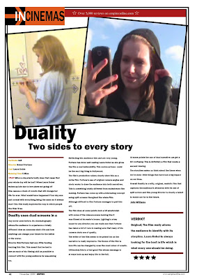
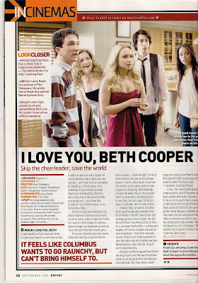
I found the film magazine a bit harder as I have never produced a film review before so I took my inspiration from Empire magazine the “UK’s best selling film review magazine”. In my research I found out that if you get a good rating in Empire magazine then the film is more likely to get a good reputation for example Slumdog Millionaire was given a very high rating in Empire magazine. This rating allowed people who read Empire magazine to understand what the Empire critics think of the film. As the critics in the Empire magazine are opinion leaders within the two step flow theory it means that the message they are passing onto the people who read the magazine will have a positive or negative effect on the film as they listen to the opinion leaders.

When planning my ancillary review I wanted it to look as much like the real film review in any Empire magazine so I decided that I would copy the lay out and try and use the same sort of language which the critics use. I wanted the audience to pick up the film review which I created and think that I had just cut it out of the Empire magazine. I feel that I achieved this with me using many of the different conventions the magazine uses on my review. Another convention of the magazine is to have three columns of writing on any A4 review, Empire also has a sum up box at the end which gives the audience a few words of the film which make it stand out. The stars at the end of the review are also very critical as this is the main way they show the audience in a visual way how well they think the film will do. I have managed to create the effect that it has come out of the Empire magazine by using these conventions this adds to the realism of the brand image product. The picture I have used at the top of my film magazine are actual shots which I took on set, this is another convention of Empire magazine which I found in my research.
As I wanted to make my whole idea different unconventional I thought I would create a different looking poster. With my main idea being about split screen and dual narrative I came up with the idea that I could have two posters which would look like my main production which creates a brand image. I would also use the convention of two pictures going against each other. This would create enigma as the audience would wonder why I have decided to have two slides to my poster. I also got some of my inspiration with the Sliding Doors poster as it is split in half but only on an A4 piece of paper.
My design has the same concept but is different with it being an A3 and the page is split in half. Both sides of the poster show a different image of my main character one being happy and the other side being unhappy and sad. When the audience view my poster and the film they are able to have a brand image in their head with the consistent feel of split screen through out. My poster uses a tree to represent the different mise-en-scene which the film will be placed in. One being full of leaves and happiness and but the other side is dead with the dead tree. This creates enigma as they don’t know what will happen to the main character as the she is position in the same place on both sides of the poster. The title Duality is clear across the top of the poster with this something which I found when researching is a common convention to have. The title would also anchor the picture to the text. The poster needed to have something which made it stand out, this is why on one half of the poster all the writing is backwards this is so it looks like the other poster has been mirrored onto the right hand side but with a different looking images which give the audience a slight insight into what the film might involve.
I found the film magazine a bit harder as I have never produced a film review before so I took my inspiration from Empire magazine the “UK’s best selling film review magazine”. In my research I found out that if you get a good rating in Empire magazine then the film is more likely to get a good reputation for example Slumdog Millionaire was given a very high rating in Empire magazine. This rating allowed people who read Empire magazine to understand what the Empire critics think of the film. As the critics in the Empire magazine are opinion leaders within the two step flow theory it means that the message they are passing onto the people who read the magazine will have a positive or negative effect on the film as they listen to the opinion leaders.
When planning my ancillary review I wanted it to look as much like the real film review in any Empire magazine so I decided that I would copy the lay out and try and use the same sort of language which the critics use. I wanted the audience to pick up the film review which I created and think that I had just cut it out of the Empire magazine. I feel that I achieved this with me using many of the different conventions the magazine uses on my review. Another convention of the magazine is to have three columns of writing on any A4 review, Empire also has a sum up box at the end which gives the audience a few words of the film which make it stand out. The stars at the end of the review are also very critical as this is the main way they show the audience in a visual way how well they think the film will do. I have managed to create the effect that it has come out of the Empire magazine by using these conventions this adds to the realism of the brand image product. The picture I have used at the top of my film magazine are actual shots which I took on set, this is another convention of Empire magazine which I found in my research.


In what ways does your media product use, develop or challenge forms and conventions of real media products?
When I started the product I went in with an open mind as I wanted to do something unconventional. I did this by introducing an idea which has been touched upon in mainstream Hollywood movies but had not been done to the extreme which I carried out. I used a Split Screen effect throughout the whole 5 minute film which was a real challenge. This challenges the original conventions of a 5 minute film as a conventional film would be linear with there only being one main narrative for the audience to be able to follow on the big screen. In my case it means that the audience have to work a bit harder as they have to watch two screens at the same time and understand two different narratives. Which in some cases means that the audience will not understand what is going on. This is why at some points one narrative runs slower that the other so that the audience can understand the two different narratives at the same time for example, On the left hand side of the screen the kitchen scene is longer this allows the audience to understand that she is not in a rush and has plenty of time to meet her boyfriend at the time they agreed. When conducting my research I found that some 5 minute films used dual screens but over used them and the narrative was very hard to follow.
this is something which I wanted not to end up doing as a result it meant that my idea would only consist of two narratives with two screens. I felt that if I kept my dual screen simple then the audience will be able to understand the movie better. Also within my research I watched Sliding Doors (1998) which allowed me to understand how mainstream romantic films are produced and directed. The director Peter Howitt had used many steady mid camera shots. This allowed the audience to see the whole frame and what mise-en-scene was involved. This is something which I found in my research which I would want to include as mid shots are simple to set up but can be very effective as it can bridge the gap between a long or wide shot and a close-up without the audience getting confused. The use of close ups of the characters in Sliding doors really allowed the audience to understand the expressions which the characters are feeling. In my film I have tried to use as many closes ups as I could to try and get across the different expressions on the actresses face. I used close ups to increase dramatic effect for the audience. This is where I tried to develop the close up camera shot, as I had two screen side by side it meant that each shot would be smaller for the viewing audience. This meant that it would be harder for the audience to see the characters face which meant that the audience could find it hard to understand what emotions the character are going through. This is why when I filmed a close up on the characters face I would make sure I held the shot for a little bit longer so that audience are able to scan across both screens and take in what is happening before moving onto the next shot. In my product I use Todorov’s theory with it having equilibrium, disruption and the resolution of disruption. This theory can be seen throughout my film with it being used in both narratives. With this theory being used in many mainstream films it meant that the audience will expect certain things to happen. In Sliding Doors the girlfriend after all her trouble managed to find the boyfriend again and they lived happily ever after. That is a basic outline of the story. This is something which I didn’t want to do. I felt that if I made my story end happily every ever it will not be different even with the dual screens. I needed to create a storyline slightly different so it captures my audience imagination. This is why I challenged the convention of a romance genre. I wanted to have the audiences expectations challenged. In one narrative the boyfriend ends the relationship and the other narrative ends with the boyfriend getting run over. After showing my film to my target audience I got a comment “that was the last thing I was expecting to happen.”.
This meant that the audience member was expecting something different to happen and she really had to think about how the narrative managed to get there. My narrative really needs an active audience so they can follow both narratives and understand the twist at the end. This is different than most romantic films as stereotypically all characters are happy at the end of the film.
When I was doing my research I only came across one film which uses the split screen effect more than once (Sliding Doors 1998), this was the mainstream film which really inspired me to run two narratives the whole time. I tried to follow as many conventions as I could with in my two narrative stories. Sliding Doors used a non linear timeline which saw the narrative use flash backs and the director puts different times of day together all mixed up. I wanted to try and stay away from flash backs as I felt that they would be very hard to create with the technology I had available ad would look very amateurish. Sliding Doors gave me the idea of my main character waking up late which meant that a series of events will happen after she wakes up. In Sliding Doors the main character is late for the train which means that a series of events happen in many different ways. I changed this idea so it was my own with the fact that I would have two videos running side by side with the same character in both narratives. When conducting my research I found that many different amateur films have used conventional shots for example in Bottom Draw
they have used standard camera shot, with lots of mid shots and long shots. After a while I found it a bit boring. This is why I have tried to use many different camera areas from mid angle shots to a tracking shot. I did this to try and develop the conventions of real media products. My favourite shot is the tracking shot through the trees this was done with me driving parallel to the pavement and filming out the car window. This shot is totally different and is used many times within mainstream romance films but when I was researching 5 minute amateur films it was not used at all.
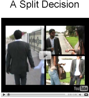
If you watch the left screen this is the tracking shot. Another camera shot which is different is the shot out of the bread bin.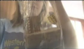 This allows a different dimension for the audience to see. One more camera shot which is different is the one out of the cupboard through the glass this distorts the camera focus which means when Laura pulls out the glass the camera focuses on her which is a really good effect.
  If I was going to produce this film and sell it to my target audience I would need funding by many different companies to be able to get the film started. This is why at the start of the film I used Virgin Media Shorts and Film4 films to fund my product. I put this into my product as it gives my final production a professional feel. I decided to go with Virgin Media Shorts as I felt it was a company which are very good at spotting good talent and specialise in 5 minute films As Film4 are very into their independent films and their target audience are of the same age as mine, I thought I would be appropriate for them to fund me. With Film4 being such a big sub company of Channel 4 it means that they will have big connections within the industry which could see higher production values. Binary opposition is constructed in both my narratives as in the left screen the main character wakes up on time and has plenty of time to get ready but on the other side she wakes up late which goes against each other. Binary opposition is constructed throughout my project with both narratives showing the audience how life can be different. I used Binary opposition to the extreme so that the audience can identify clearly that the character is the same person but is in a different situation. I decided to have to twist at the end so that the audience didn’t expect the expected. With the ending the Binary opposition is ended as both narratives end the same with the main character, sitting down and crying.
 The preferred reading of the text is that the audience should not take things for granted and you don’t know what life with throw at you round the corner so live life to the full. But the oppositional reading of the film could be that what ever you do something negative will happen to you which will affect your life for ever. These reading are along the same lines of the narratives with both of them relating to Binary Opposition.
Final Film
this is something which I wanted not to end up doing as a result it meant that my idea would only consist of two narratives with two screens. I felt that if I kept my dual screen simple then the audience will be able to understand the movie better. Also within my research I watched Sliding Doors (1998) which allowed me to understand how mainstream romantic films are produced and directed. The director Peter Howitt had used many steady mid camera shots. This allowed the audience to see the whole frame and what mise-en-scene was involved. This is something which I found in my research which I would want to include as mid shots are simple to set up but can be very effective as it can bridge the gap between a long or wide shot and a close-up without the audience getting confused. The use of close ups of the characters in Sliding doors really allowed the audience to understand the expressions which the characters are feeling. In my film I have tried to use as many closes ups as I could to try and get across the different expressions on the actresses face. I used close ups to increase dramatic effect for the audience.
 This is where I tried to develop the close up camera shot, as I had two screen side by side it meant that each shot would be smaller for the viewing audience. This meant that it would be harder for the audience to see the characters face which meant that the audience could find it hard to understand what emotions the character are going through. This is why when I filmed a close up on the characters face I would make sure I held the shot for a little bit longer so that audience are able to scan across both screens and take in what is happening before moving onto the next shot. In my product I use Todorov’s theory with it having equilibrium, disruption and the resolution of disruption. This theory can be seen throughout my film with it being used in both narratives. With this theory being used in many mainstream films it meant that the audience will expect certain things to happen. In Sliding Doors the girlfriend after all her trouble managed to find the boyfriend again and they lived happily ever after. That is a basic outline of the story. This is something which I didn’t want to do. I felt that if I made my story end happily every ever it will not be different even with the dual screens. I needed to create a storyline slightly different so it captures my audience imagination. This is why I challenged the convention of a romance genre. I wanted to have the audiences expectations challenged. In one narrative the boyfriend ends the relationship and the other narrative ends with the boyfriend getting run over. After showing my film to my target audience I got a comment “that was the last thing I was expecting to happen.”.
This meant that the audience member was expecting something different to happen and she really had to think about how the narrative managed to get there. My narrative really needs an active audience so they can follow both narratives and understand the twist at the end. This is different than most romantic films as stereotypically all characters are happy at the end of the film.
When I was doing my research I only came across one film which uses the split screen effect more than once (Sliding Doors 1998), this was the mainstream film which really inspired me to run two narratives the whole time. I tried to follow as many conventions as I could with in my two narrative stories. Sliding Doors used a non linear timeline which saw the narrative use flash backs and the director puts different times of day together all mixed up. I wanted to try and stay away from flash backs as I felt that they would be very hard to create with the technology I had available ad would look very amateurish. Sliding Doors gave me the idea of my main character waking up late which meant that a series of events will happen after she wakes up. In Sliding Doors the main character is late for the train which means that a series of events happen in many different ways. I changed this idea so it was my own with the fact that I would have two videos running side by side with the same character in both narratives. When conducting my research I found that many different amateur films have used conventional shots for example in Bottom Draw
they have used standard camera shot, with lots of mid shots and long shots. After a while I found it a bit boring. This is why I have tried to use many different camera areas from mid angle shots to a tracking shot. I did this to try and develop the conventions of real media products. My favourite shot is the tracking shot through the trees this was done with me driving parallel to the pavement and filming out the car window. This shot is totally different and is used many times within mainstream romance films but when I was researching 5 minute amateur films it was not used at all.
If you watch the left screen this is the tracking shot. Another camera shot which is different is the shot out of the bread bin.
 This allows a different dimension for the audience to see. One more camera shot which is different is the one out of the cupboard through the glass this distorts the camera focus which means when Laura pulls out the glass the camera focuses on her which is a really good effect.
  If I was going to produce this film and sell it to my target audience I would need funding by many different companies to be able to get the film started. This is why at the start of the film I used Virgin Media Shorts and Film4 films to fund my product. I put this into my product as it gives my final production a professional feel. I decided to go with Virgin Media Shorts as I felt it was a company which are very good at spotting good talent and specialise in 5 minute films As Film4 are very into their independent films and their target audience are of the same age as mine, I thought I would be appropriate for them to fund me. With Film4 being such a big sub company of Channel 4 it means that they will have big connections within the industry which could see higher production values. Binary opposition is constructed in both my narratives as in the left screen the main character wakes up on time and has plenty of time to get ready but on the other side she wakes up late which goes against each other. Binary opposition is constructed throughout my project with both narratives showing the audience how life can be different. I used Binary opposition to the extreme so that the audience can identify clearly that the character is the same person but is in a different situation. I decided to have to twist at the end so that the audience didn’t expect the expected. With the ending the Binary opposition is ended as both narratives end the same with the main character, sitting down and crying.
 The preferred reading of the text is that the audience should not take things for granted and you don’t know what life with throw at you round the corner so live life to the full. But the oppositional reading of the film could be that what ever you do something negative will happen to you which will affect your life for ever. These reading are along the same lines of the narratives with both of them relating to Binary Opposition.
Final Film
Tuesday, 23 February 2010
Subscribe to:
Comments (Atom)