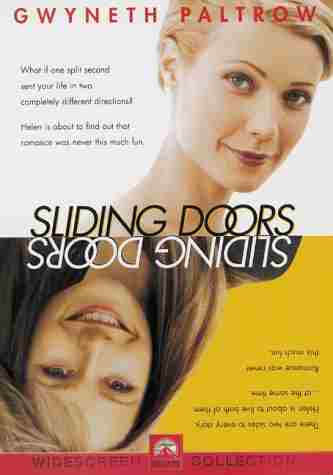
As I wanted to make my whole idea different unconventional I thought I would create a different looking poster. With my main idea being about split screen and dual narrative I came up with the idea that I could have two posters which would look like my main production which creates a brand image. I would also use the convention of two pictures going against each other. This would create enigma as the audience would wonder why I have decided to have two slides to my poster. I also got some of my inspiration with the Sliding Doors poster as it is split in half but only on an A4 piece of paper.
My design has the same concept but is different with it being an A3 and the page is split in half. Both sides of the poster show a different image of my main character one being happy and the other side being unhappy and sad. When the audience view my poster and the film they are able to have a brand image in their head with the consistent feel of split screen through out. My poster uses a tree to represent the different mise-en-scene which the film will be placed in. One being full of leaves and happiness and but the other side is dead with the dead tree. This creates enigma as they don’t know what will happen to the main character as the she is position in the same place on both sides of the poster. The title Duality is clear across the top of the poster with this something which I found when researching is a common convention to have. The title would also anchor the picture to the text. The poster needed to have something which made it stand out, this is why on one half of the poster all the writing is backwards this is so it looks like the other poster has been mirrored onto the right hand side but with a different looking images which give the audience a slight insight into what the film might involve.
I found the film magazine a bit harder as I have never produced a film review before so I took my inspiration from Empire magazine the “UK’s best selling film review magazine”. In my research I found out that if you get a good rating in Empire magazine then the film is more likely to get a good reputation for example Slumdog Millionaire was given a very high rating in Empire magazine. This rating allowed people who read Empire magazine to understand what the Empire critics think of the film. As the critics in the Empire magazine are opinion leaders within the two step flow theory it means that the message they are passing onto the people who read the magazine will have a positive or negative effect on the film as they listen to the opinion leaders.
When planning my ancillary review I wanted it to look as much like the real film review in any Empire magazine so I decided that I would copy the lay out and try and use the same sort of language which the critics use. I wanted the audience to pick up the film review which I created and think that I had just cut it out of the Empire magazine. I feel that I achieved this with me using many of the different conventions the magazine uses on my review. Another convention of the magazine is to have three columns of writing on any A4 review, Empire also has a sum up box at the end which gives the audience a few words of the film which make it stand out. The stars at the end of the review are also very critical as this is the main way they show the audience in a visual way how well they think the film will do. I have managed to create the effect that it has come out of the Empire magazine by using these conventions this adds to the realism of the brand image product. The picture I have used at the top of my film magazine are actual shots which I took on set, this is another convention of Empire magazine which I found in my research.


No comments:
Post a Comment